
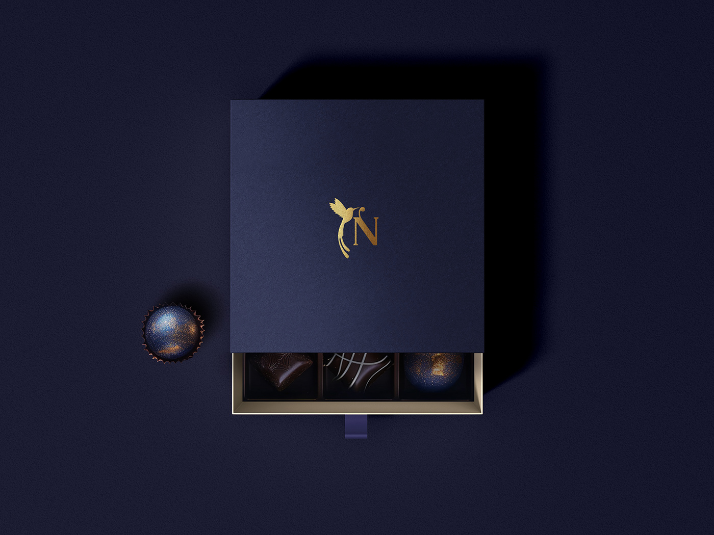
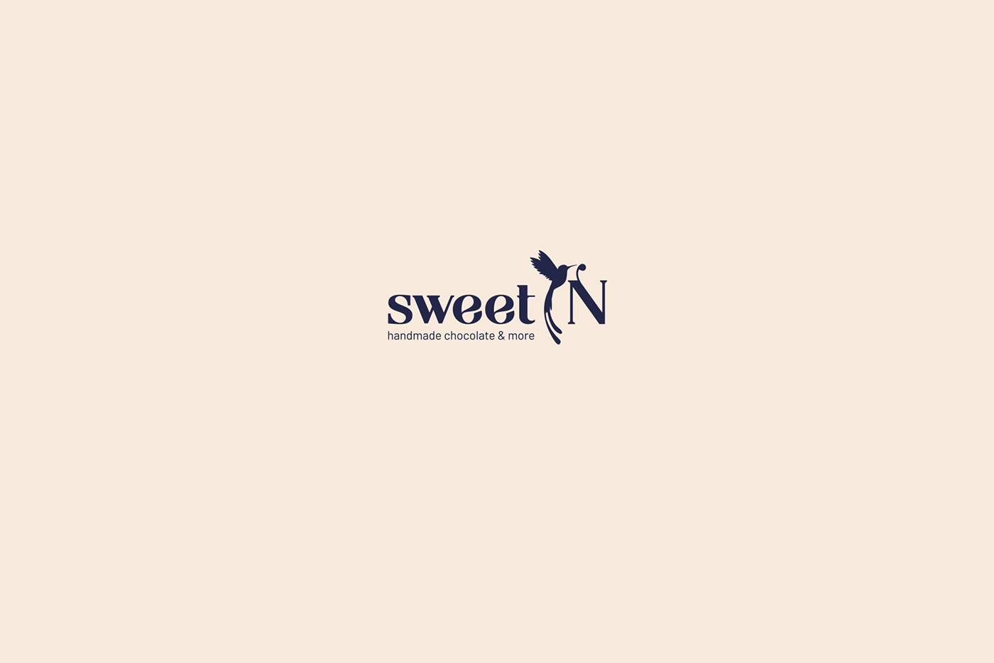
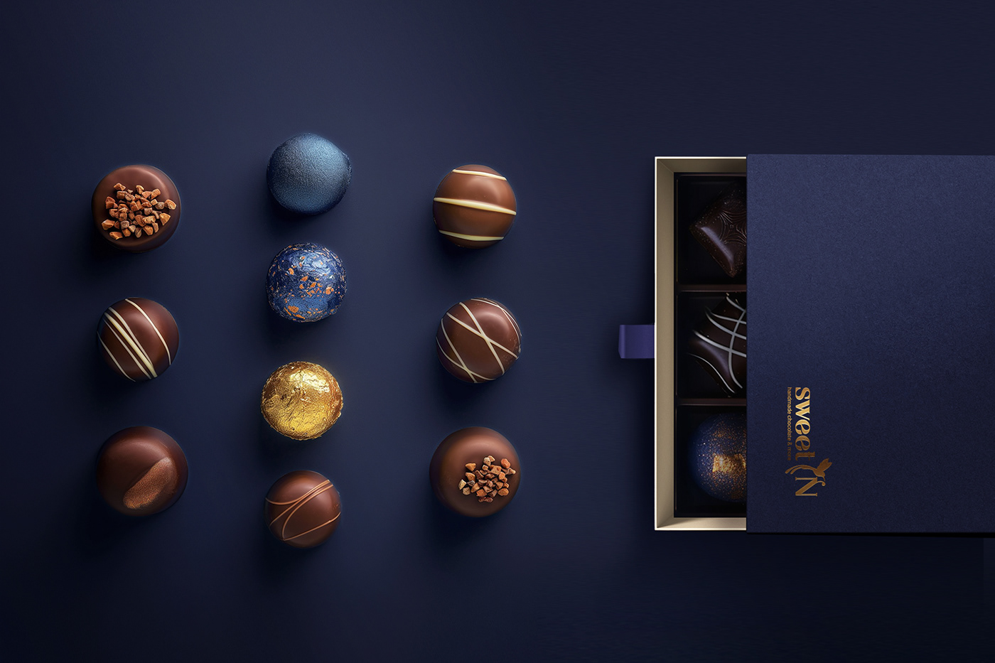
SWEET N
Luxury pastry house
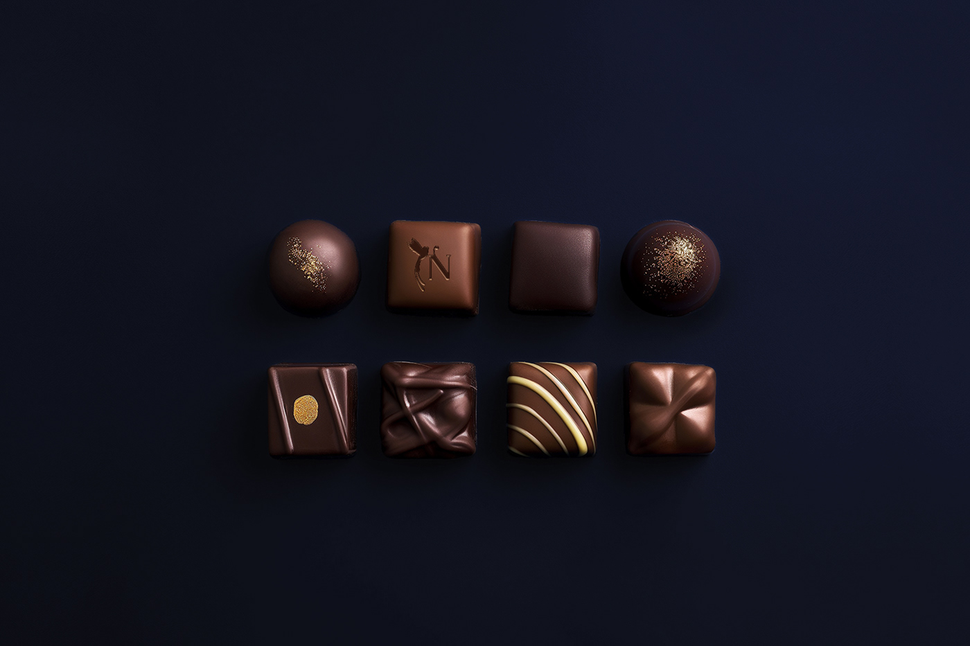
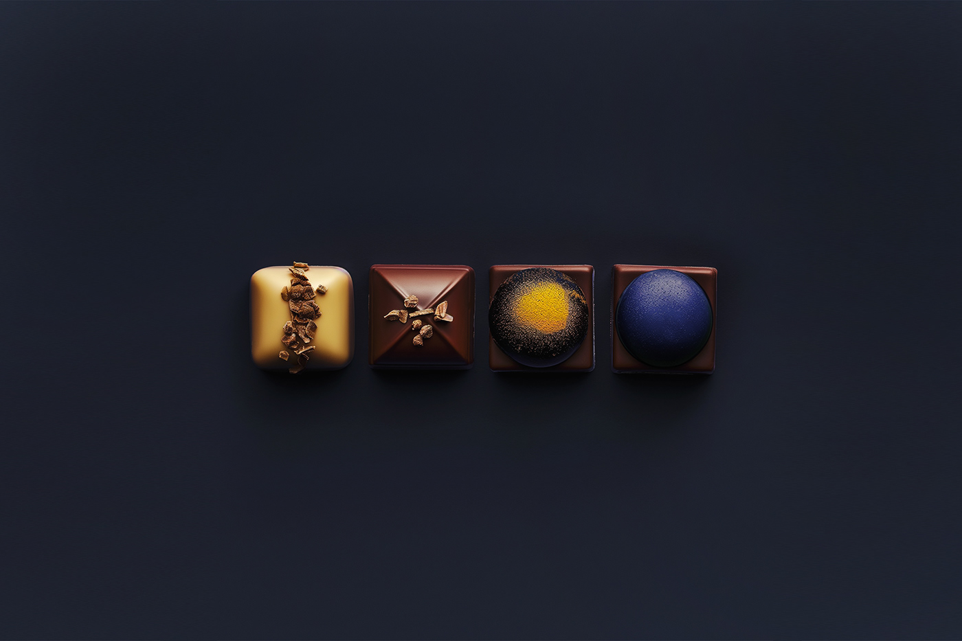
SWEET N is the private confectionery that produces handmade
chocolates with unique recipes.
SWEET N's confectioner has been trained by renowned master
chocolatiers in France and Belgium.
The recipes are unique and include exclusive ingredients from
different parts of the world.


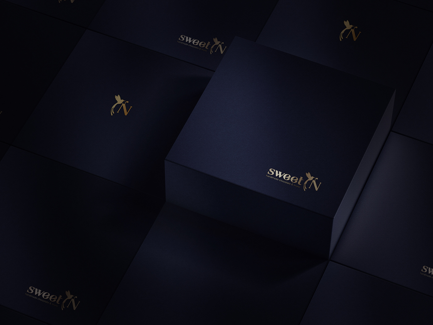
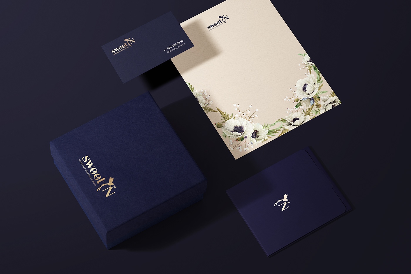
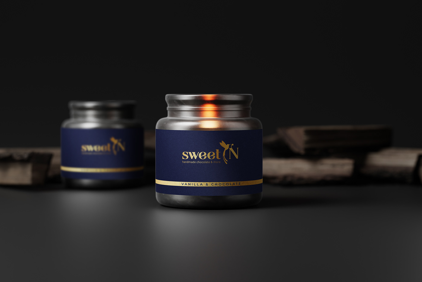
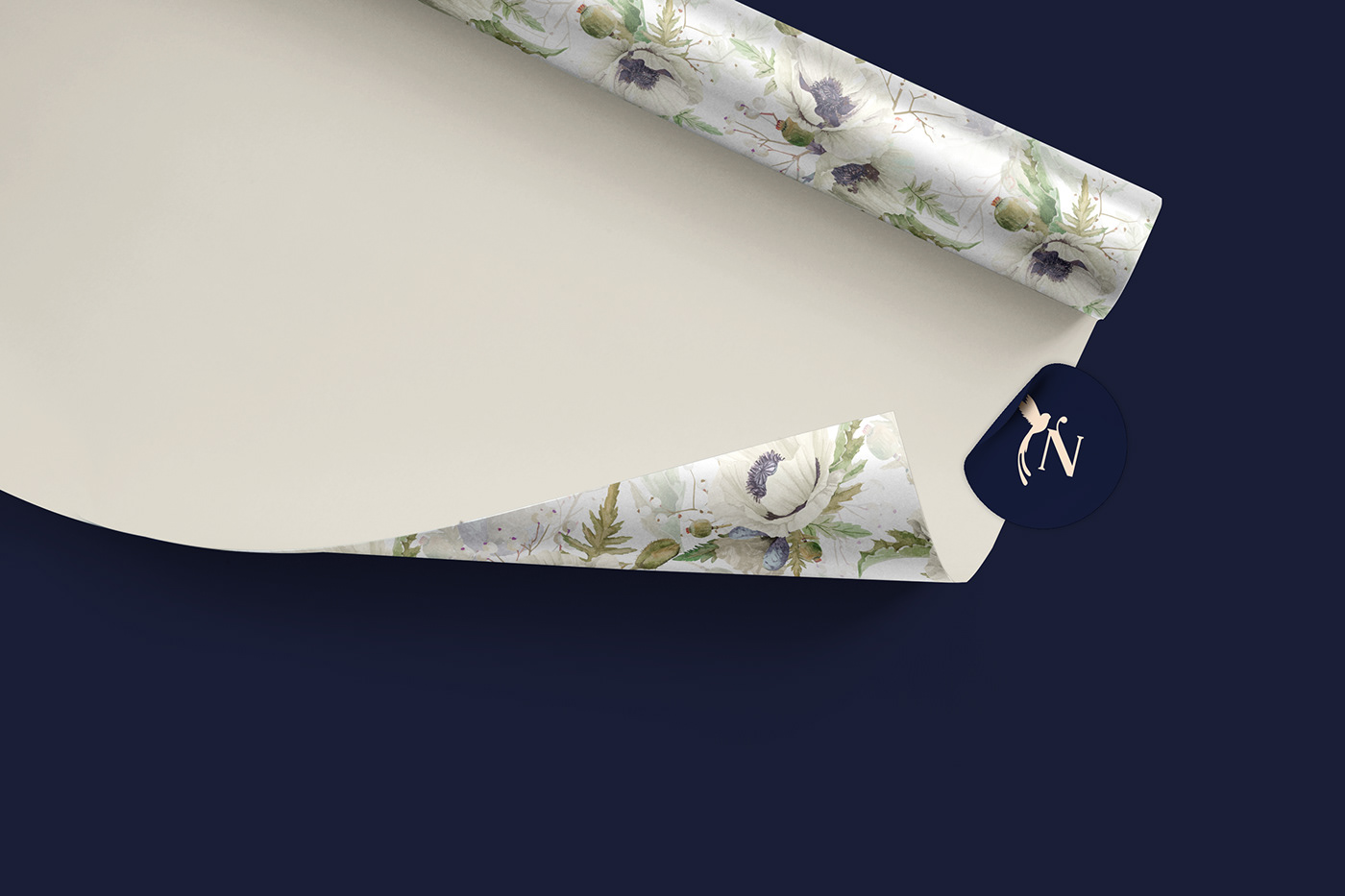
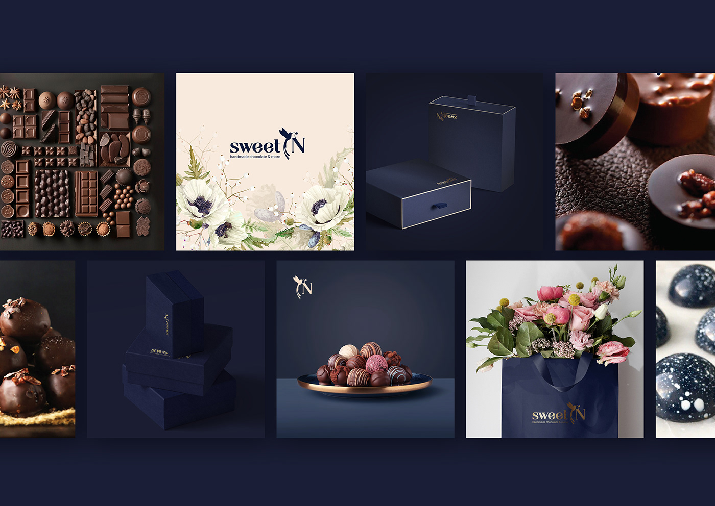
The colors of the night sky and morning air were chosen for
the packaging.Minimalism and quality materials make the packaging
a desirable exclusive gift.
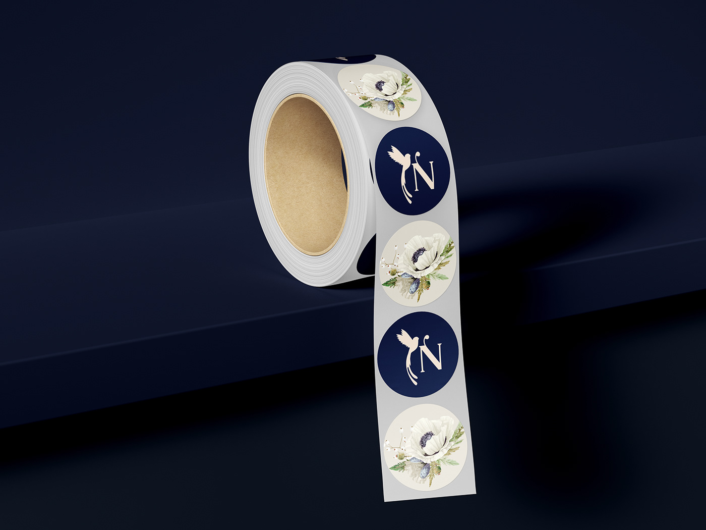
The brand symbol included in the logo is a small hummingbird
drinking the morning dew.


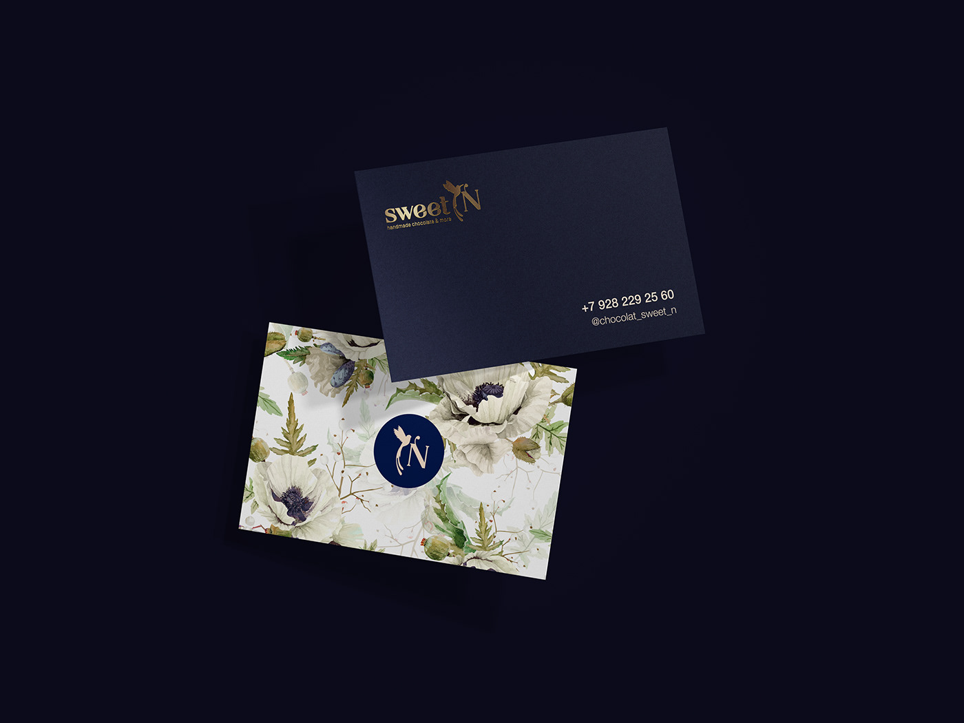
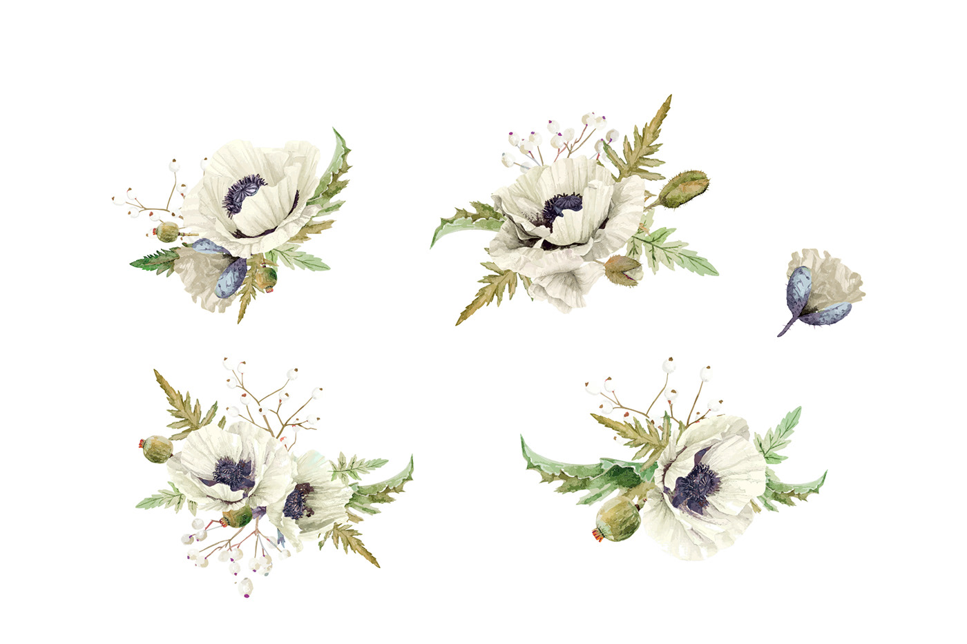
The white poppy flowers were the inspiration for the pattern creation
Watercolor colors and technique give tenderness, individuality and beauty.
Watercolor colors and technique give tenderness, individuality and beauty.
The reverent and delicate flowers convey the feelings that want to express the one who gives unique chocolates to his/her favorite person.
By weaving the individual flowers and twigs together, an airy, delicate pattern for true connoisseurs is created.
The pattern was created by hand with love and attention to detail of each flower.
The pattern is used in packaging materials and materials for social media and advertisements.
This is a sweet declaration of love!
Pattern & elements


About packaging


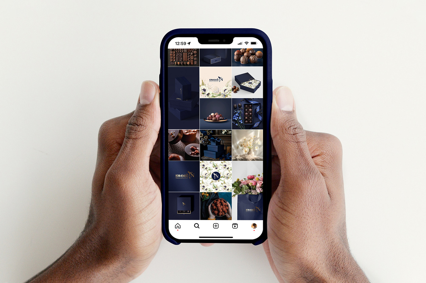
Visual content & social media
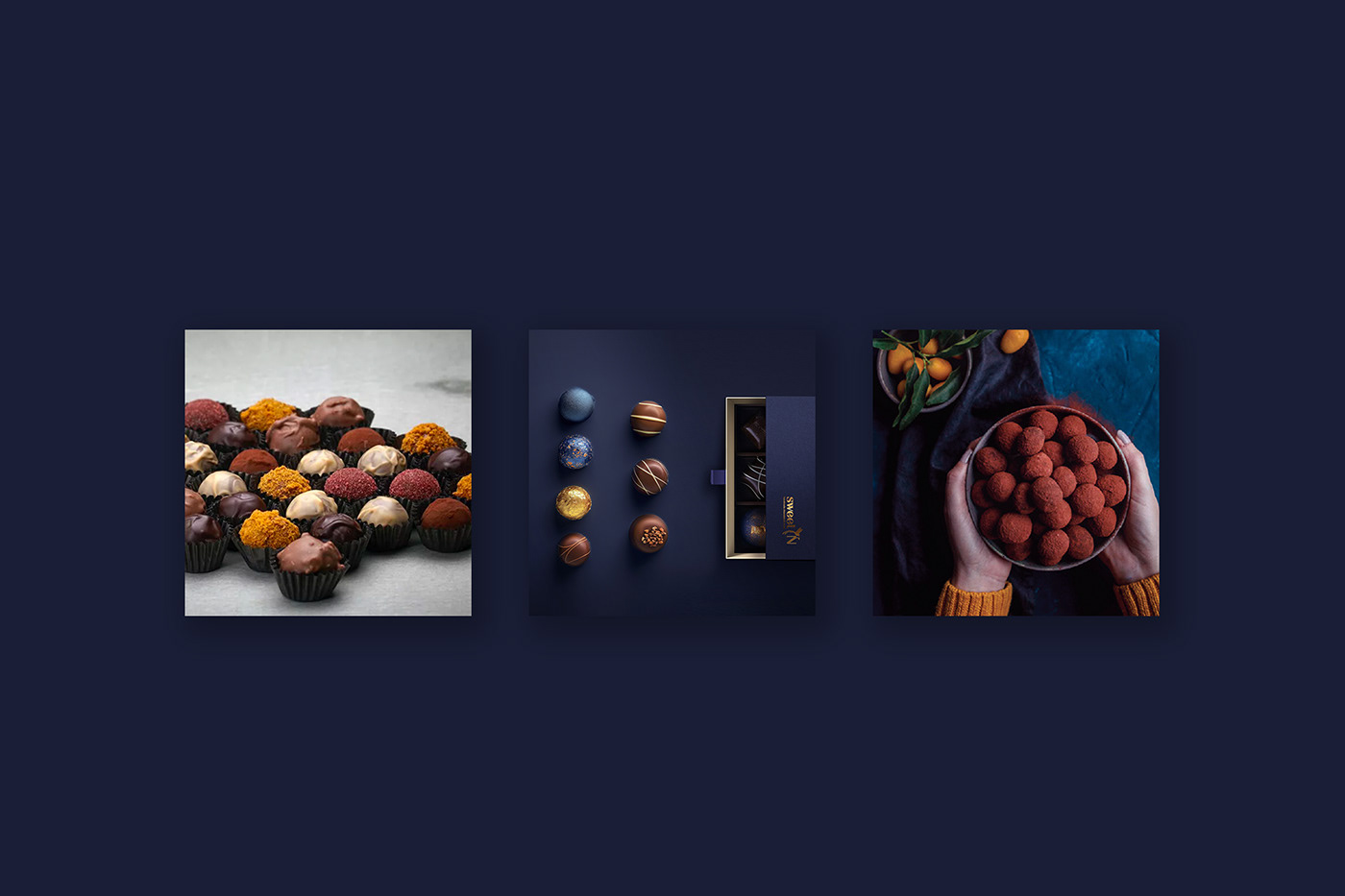
Other Gifts